an ethereal brand and digital design showcasing a one-of-a-kind vacation experience.
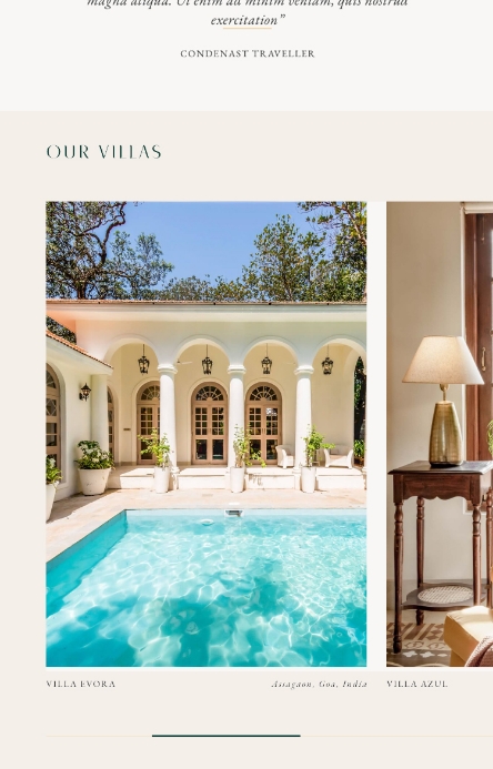
During the pandemic, when people began to turn inward, pausing and reflecting on new ways of being, a group of young and enterprising hoteliers approached us with the concept of Villaasa. They envisioned a luxurious private nook, where families, young couples or friends could take some time away from the hustle and bustle of the real world, unwinding to the gentle lullabies of the sea, the whistling breeze and the cooing of birds amidst the sandy shores of Goa.
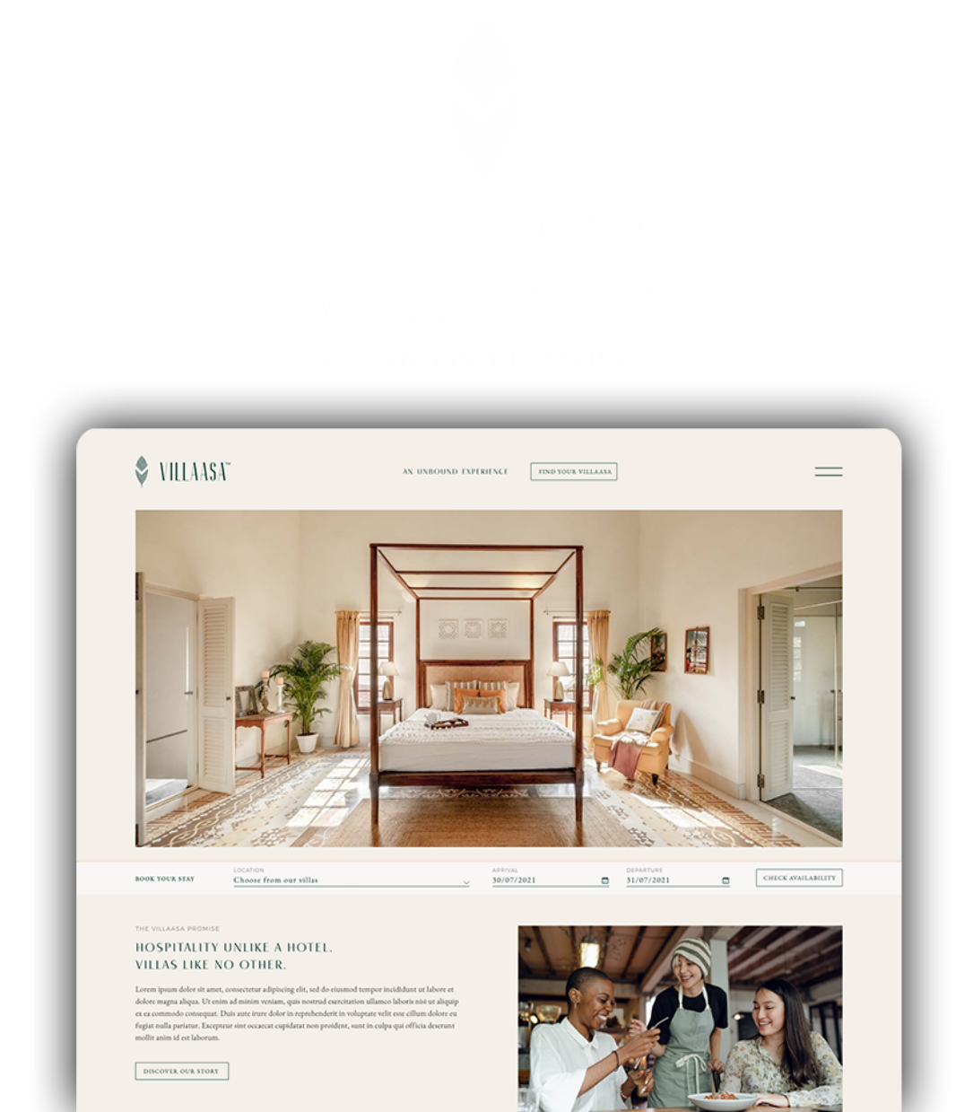
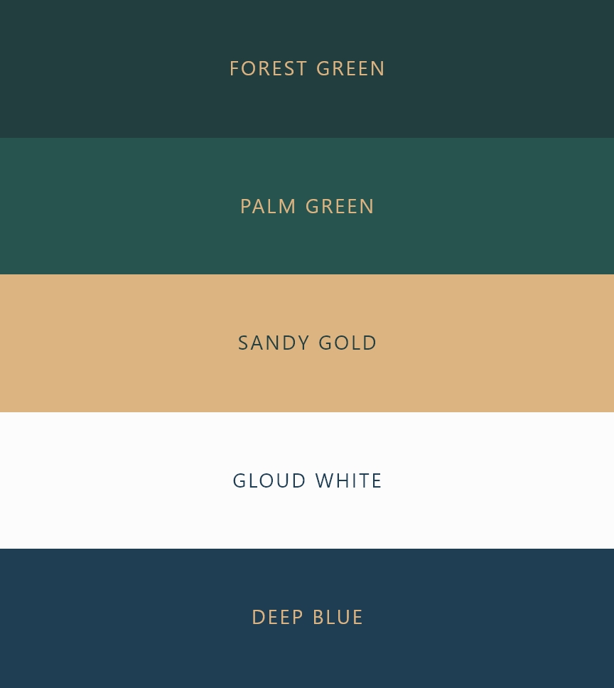
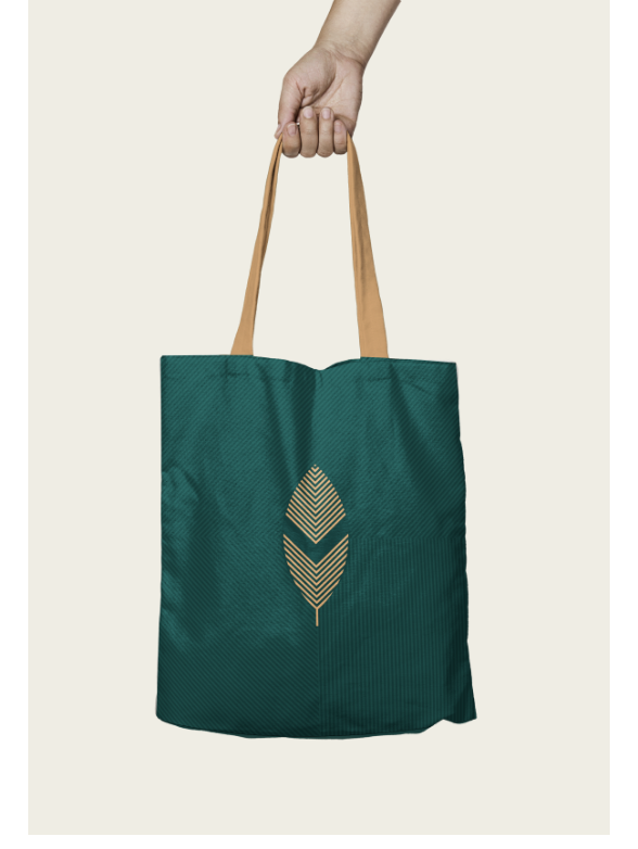
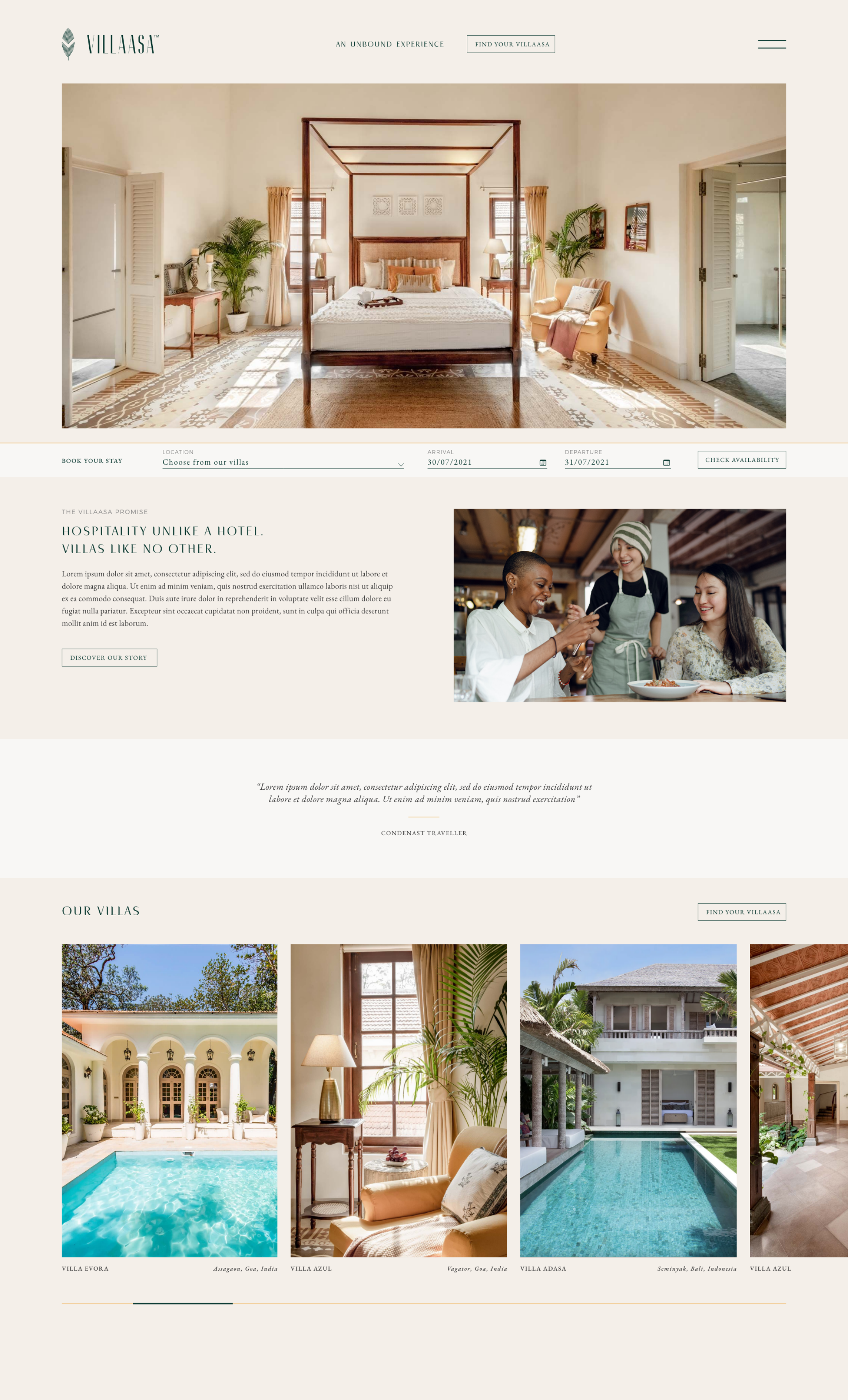
As our journey began with Villaasa, our objective was to design a brand identity that conveys the tranquillity that it offers its audiences. We wanted the logo to reflect the aesthetics and ambience of the setting, highlighting the features of security, intimacy and serenity that vacation goers will experience on their stay with Villaasa. Its rich and vibrant colours were inspired by the landscape of Goa, carrying the green of the forest and palm leaves, the sandy gold of the beaches, the whiteness of the clouds and the deep blue seas. With elements of nature instilled into its core design, including the symbol of the leaf, our aim was to evoke a feeling of rejuvenation, hope, peace and calm within the user. The quiet sophistication of the typography is indicative of the luxurious environment of the villas.

During our preliminary research, we focused on the ideal way of positioning the brand amongst its clientele. These were individuals or groups who were seeking a comfortable, luxurious and private abode, where they could embrace a few days and nights in the midst of nature, which would typically not be a part of the hotel stay experience. In order to bring this experience to a diverse range of customers, we developed an aesthetically pleasing and simple website conveying the promise and prestige of a Villaasa stay. The simple, hassle free and intuitive design of the interface was helpful for the customers to book a villa of their choice and for the villa owners in managing their clientele and vacant property. Our goal through the brand identity and design was to showcase Villaasa as a one-stop place from where customers could explore novel ways of vacationing through curated experiences.

Florania Sans Serif Display Font is an elegant yet versatile font that shows beauty and classy look. Florania is fit for display, title, large sizes, and short text.
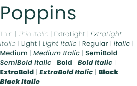
Geometric sans serif typefaces have been a well known style tool ever considering the fact that these actors took towards the world’s stage. Poppins is one of the new comers to this long tradition.
General Counsel & Co-Founder
The Maker Generation, Inc.
CEO
ABC Company
Marketing Director
XYZ Corporation
VP of Sales
123 Industries
Founder & CEO
Acme Startup